Global Consensus Toolkit
Overview
The Global Consensus Toolkit is a visual analytics platform developed to provide small and developing United Nations (UN) member states with information to make data-based decisions in negotiations at the UN and bilateral meetings.
Recognizing that most small and developing states do not have the analytical resources and workforces of larger members, this public-access portal seeks to remedy that disadvantage. Further, although it was designed initially with diplomats as the end-users in mind, the Toolkit is relevant to a broad range of UN stakeholders. These include governments and their agencies, researchers, think tanks, nonprofit organizations, advocacy groups and policy decision-makers.
The Toolkit is the product of a seven-month, experiential, interdisciplinary Diplomacy Lab project created by students in Northeastern’s College of Professional Studies for the U.S. Department of State with data sourced from the United Nations Digital Library. To date, the Toolkit has benefitted from the contributions of 85 students from the Northeastern graduate programs in Global Studies & International Relations and the undergraduate and graduate programs in Analytics.
Mission
A primary motivation for having a public access portal is to level the policy-making playing field, particularly among large, small, and developing nation-states. This is consistent with a fundamental principle of the UN: the sovereign equality of all its members. The UN General Assembly rule for every member state is one country, one vote. However, the workforce of each country’s UN mission varies substantially. For example, The Permanent Mission of the Republic of Vanuatu to the UN has two diplomats; the Permanent Mission of Mali has a team of eight diplomats. By comparison, The Permanent Mission of the United Kingdom has 48 diplomats, and the United States Mission has 150. (source: UN Blue Book).
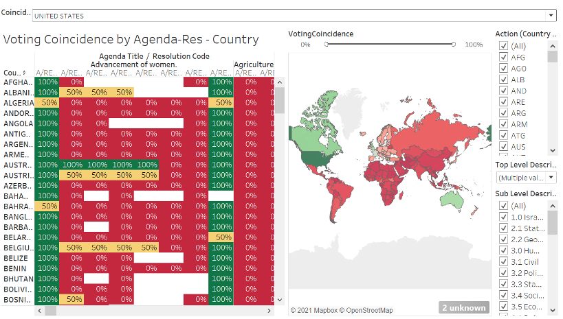
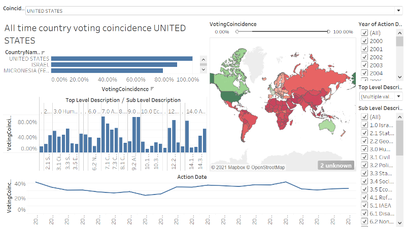
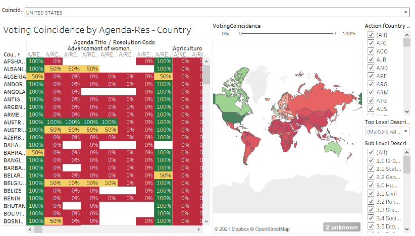
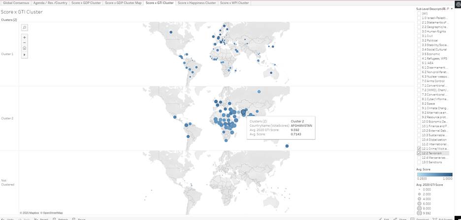
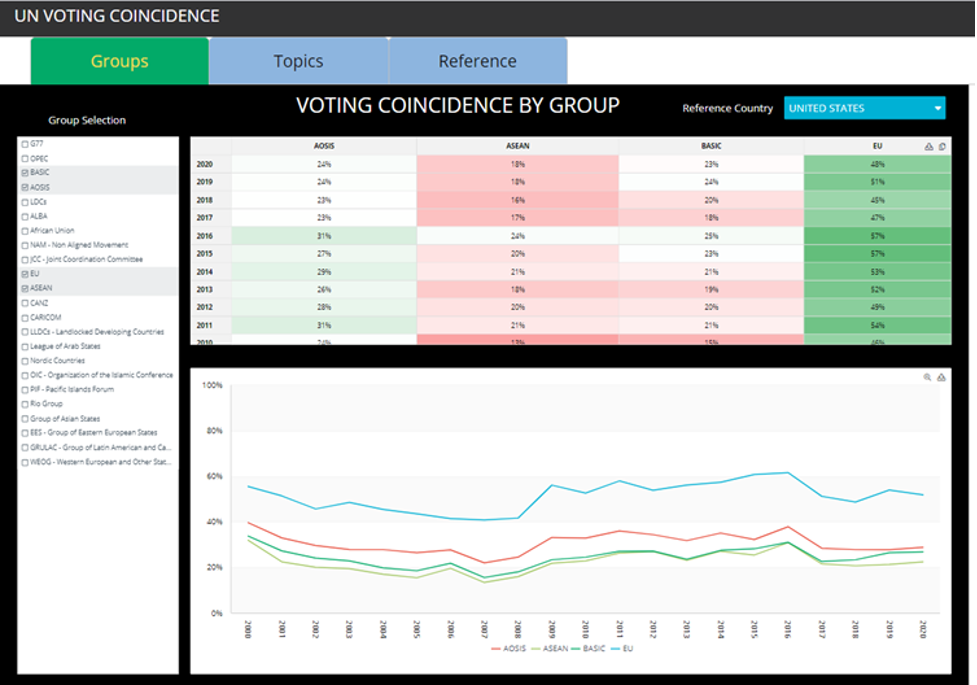
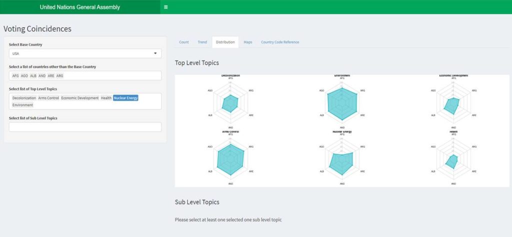
The Global Consensus Toolkit allows users to explore 20 years of UN member voting via powerful, highly intuitive, interactive dashboards. At its core, the Toolkit is a curated database of UN member state voting records supported by extensive metadata. Users can analyze the voting coincidence—how often the votes of specific stakeholders coincide—among member states and regional and economic voting blocs or based on specific issues or topics such as climate, human rights, foreign direct investment or sanctions.
Methodology
The Voting Coincidence Visualizations use metrics identified by the U.S. Department of State. The resolutions are grouped by topics and subtopics; accompanying graphs tally votes by resolution. So far, only one dashboard uses the simple tally of Yes, No, Abstain, and Absent votes (called “count” and represented by the last dashboard below). The objective is to zoom out and provide a comprehensive analysis of the data.
Audience
The Toolkit was designed to be used by a broad range of UN stakeholders, including but not limited to:
- diplomats
- government officials
- government agencies
- students of international public policy, foreign policy, international relations or law
- international organizations
- media outlets
- think tanks
- nonprofit organizations
- advocacy groups
- policy decision-makers
“It is excellent that these innovative dashboards are available as a public good: they demonstrate the potential of data analytics in multilateral diplomacy and can be useful to large and small countries alike, particularly those with limited manpower or resources. Looking forward to seeing more exciting work from the Northeastern team!”
Rebecca Webber Gaudiosi, Negotiation Trainer and Former U.S. Diplomat
Each stakeholder may desire different analyses, and users can filter and visualize the information according to their needs. Although its options are by no means exhaustive, the Toolkit does present users with a variety of choices for how to slice the data.
FEEDBACK
We’d like to know what you think! As you browse the dashboards, what are your observations? What other stories would you like to see from this data? What other useful frames or filters can you imagine? Would other forms of visualization be helpful?
For instance, would you like to see bar graphs of the count of the votes (Yes, No, Abstain, and Absent)? As an example of the Toolkit’s ongoing evolution, our plans include the addition of new metric based on the article, Third World Solidarity: The Group of 77 in the UN General Assembly by Keisuke Iida, adding to the voting coincidence metric of the U.S. State Department. Are there other metrics you would like our data scientists and current students to implement?
Please consider the questions below or send us any other feedback you have. We will make updates and recommendations based on the feedback we receive.
- What would you like to see?
- What can be improved?
- In what other ways can this data be viewed/sliced?
- What other metrics could help to shed light on this data?
Submit your feedback for individual dashboards below:
Visualization Dashboards
Meet the Faculty

Fiona Creed, Associate Teaching Professor
Dr. Creed’s career spans the diplomatic, academic, entrepreneurial and nonprofit sectors. She began as a policy analyst at the EU Delegation to the United Nations in New York City and developed that experience into her Ph.D. research on the European Union representation at the UN. As an assistant professor at University College in Cork, Ireland, Fiona taught international relations and European studies. She served as the Executive Director of the United Nations Association of Greater Boston, a nonprofit organization that educates students in diplomacy and global issues through its experiential learning program, Model UN. Fiona also served as a project lead and advisor at SOLVE MIT, a marketplace for social impact and social entrepreneurship, connecting startups with the funding and resources to solve global challenges.
Dr. Creed served as the Lead Policy Analyst on the Global Consensus Toolkit.

Francesca Grippa, Teaching Professor
Dr. Grippa’s academic expertise is at the intersection of innovation, entrepreneurship and organizational behavior. Dr. Grippa is also Faculty Affiliate at Northeastern’s Global Resilience Institute and Visiting Scholar at MIT’s Connection Science. Her research interests include collaborative innovation networks; entrepreneurship and change management. She is a long term research collaborator at the MIT Center for Collective Intelligence on themes related to Collaborative Innovation Networks.

Uwe Hohgrawe, Professor of the Practice
Dr. Hohgrawe is an analytics professional in the health and pharmaceutical markets, with more than 25 years of global experience in data analytics, competitive intelligence, forecasting, and market research. Most recently, he was vice president of global business intelligence for EMD Serono. Earlier in his career, Dr. Hohgrawe led Johnson & Johnson’s global pharmaceutical market research teams for nearly a decade, and also led business intelligence teams for GfK, one of the world’s largest market research organizations. He is a former president of the European Pharmaceutical Market Research Association and has published numerous articles on business intelligence.

Alice Mello, Associate Teaching Professor
Dr. Mello has worked in design and development of computer applications for 30 years in a variety of fields including higher education in Brazil, Germany and USA. She was a Senior Researcher at Wentworth Institute of Technology in Boston, a web application developer at Harvard Medical School and a curriculum specialist/researcher at University of Southern California/New Media Literacies. She has collaborated with One Laptop Per Child, Future of Learning Group at MIT-Media Lab and Seymour Papert Institute. Prior to Northeastern University she has taught at Wentworth Institute of Technology, Lesley University, MassBay and Bunker Hill Community Colleges. Her work includes collaborations with partners in the educational, energy, aviation, and finance industries.
Dr. Mello served as the Lead Data Scientist on the Global Consensus Toolkit.
Project Team

John King, Data Scientist
Bachelor of Science in Analytics

Peter Lake, Data Scientist
Bachelor of Science in Analytics

Zaid Shaikh, Data Scientist
Master of Professional Studies in Analytics

Ye-Min Wu, Policy Analyst
Author, Diplomat, UN negotiation trainer